
Case Studies
I spot what’s working, figure out why, then scale the heck out of it. These aren’t just pretty ads (in fact some of the best performing are not pretty at all) they’re creative plays that made it past the “let’s try it” phase and into the “don’t turn this off” zone.
Format Strategy & Testing
Concept
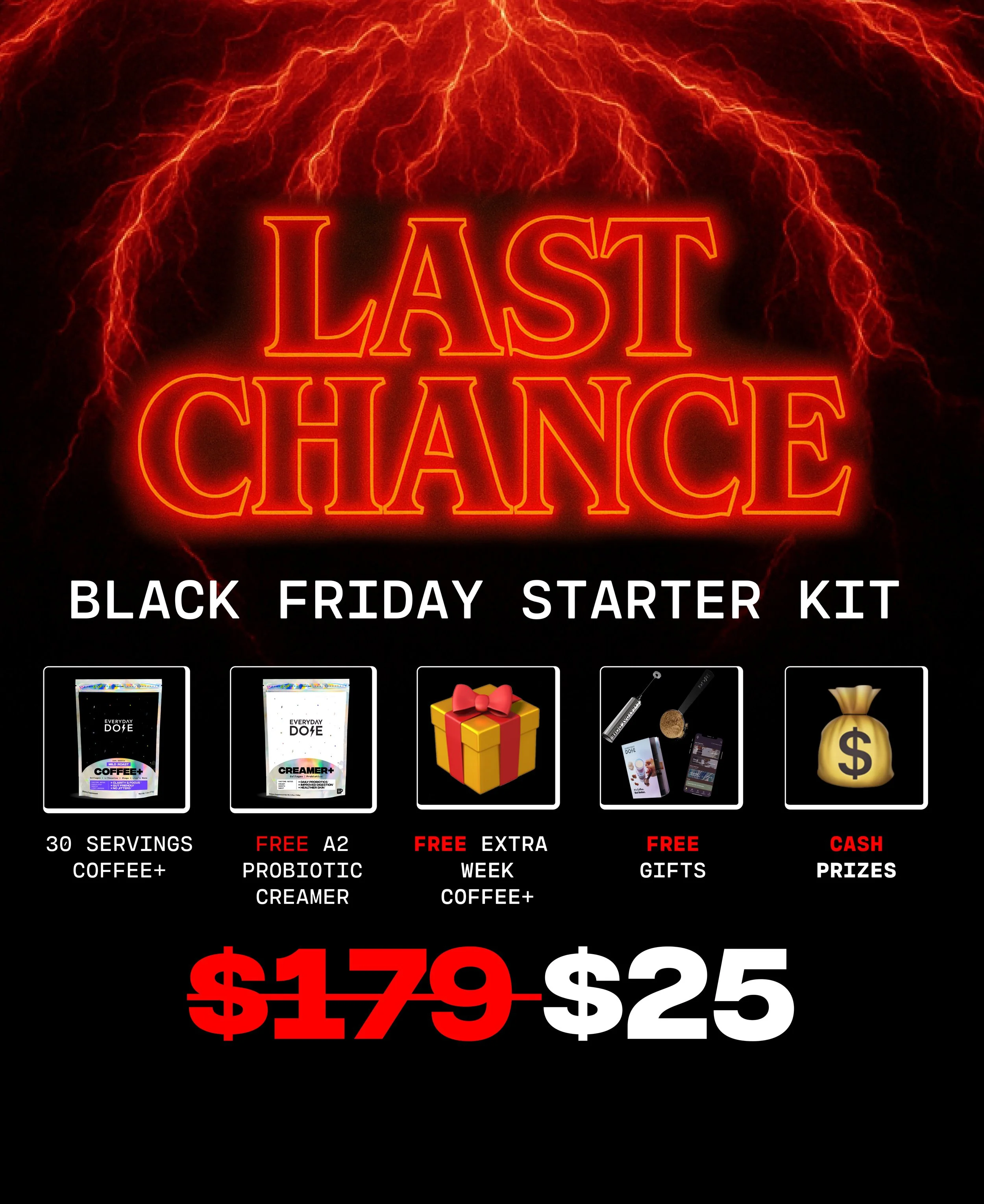
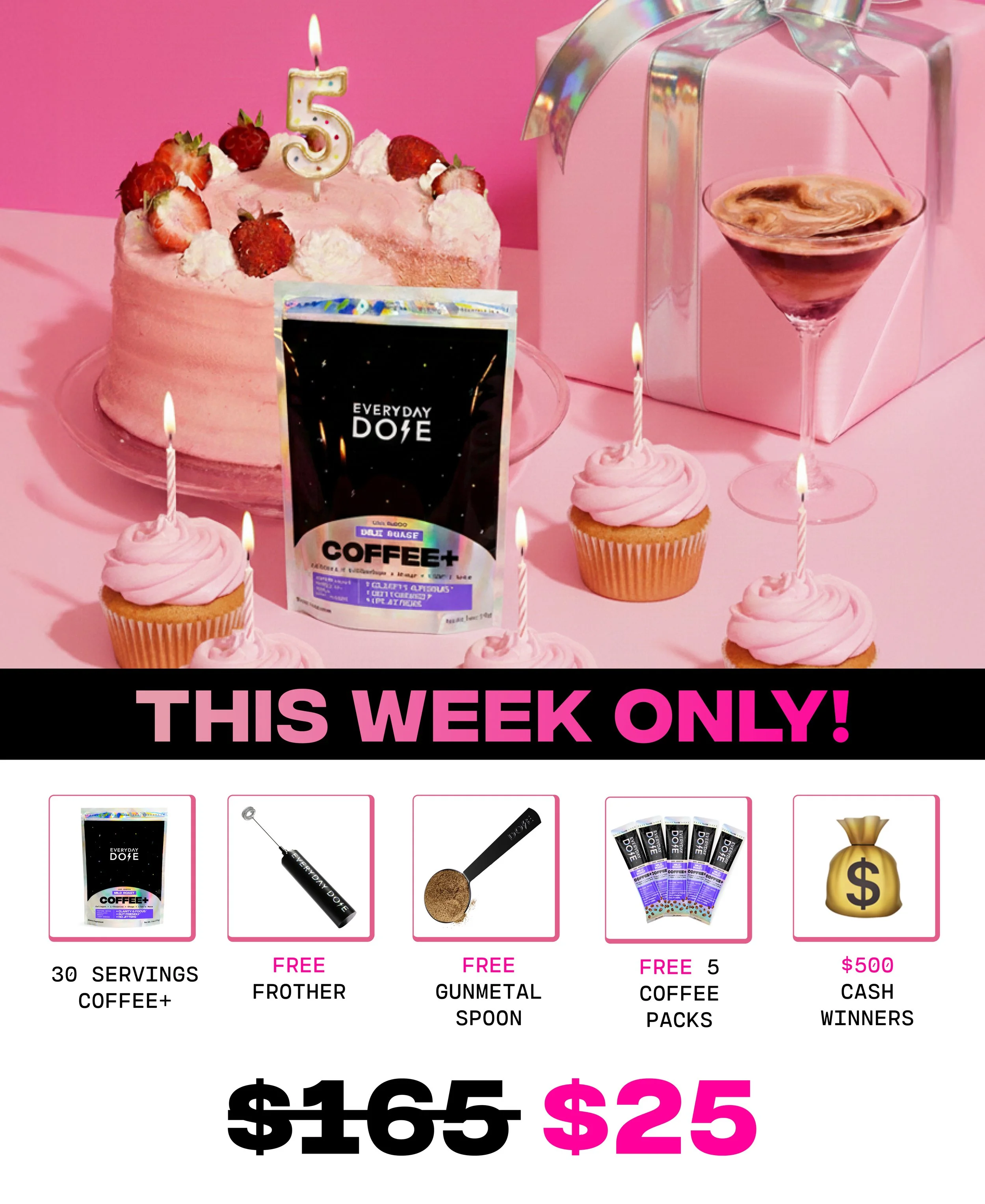
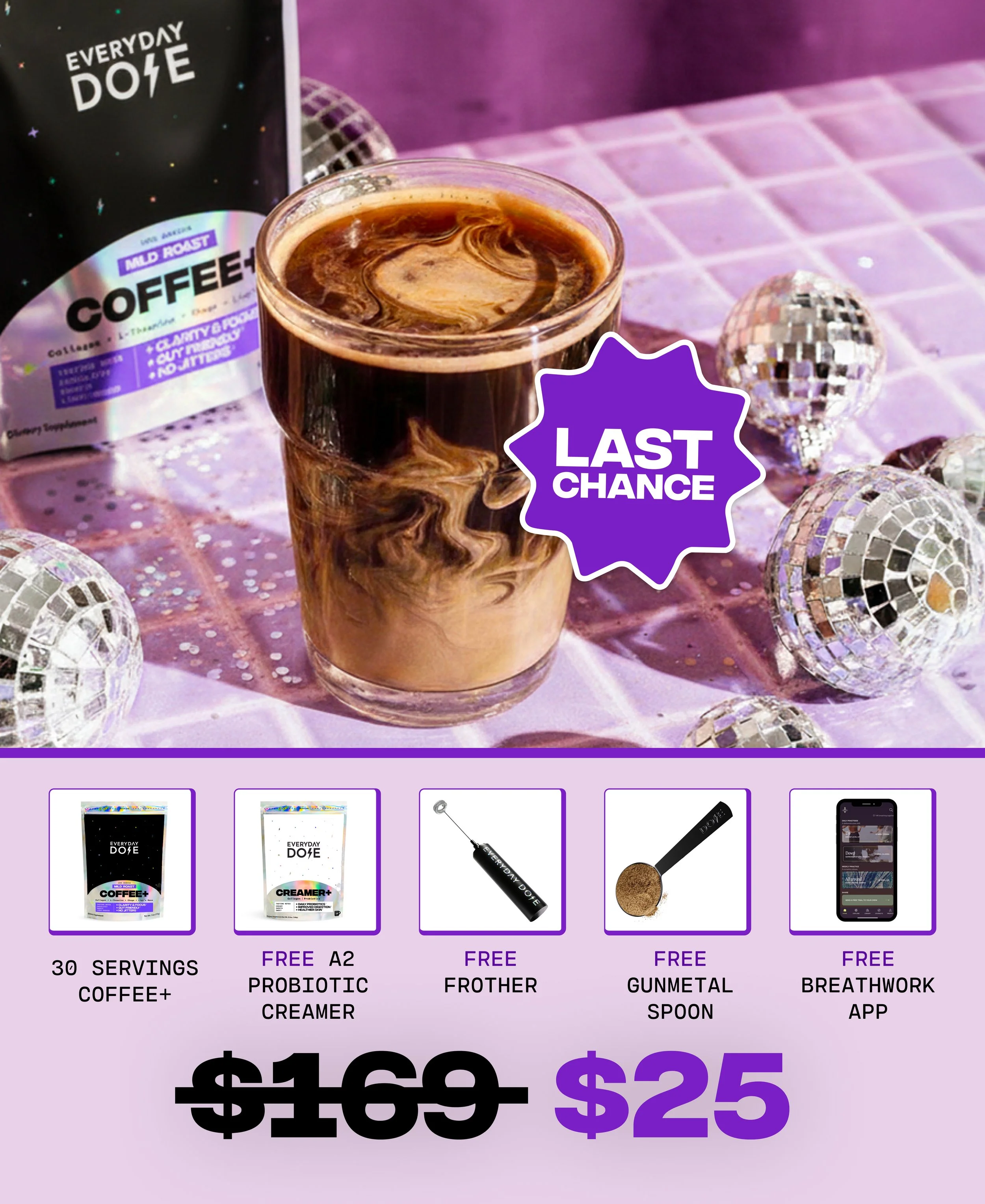
For Everyday Dose, we often promote the Starter Kit but the results have been inconsistent. Some formats land, others flop.
Insight
After reviewing performance across multiple “Starter Kit” ads, it became clear that spelling out exactly what’s in the kit, clean visuals, labeled items, clear value, outperformed jumbled, vibe-heavy layouts with no explanation. One ad in particular had quietly become a top performer.
What I Made
I built a new batch of statics based on that winning structure with the same product breakdown layout, same clear headline, but updated with fresh creative direction and new angles. I also tested variants that played off the core concept without directly copying it.
How It Played Out
The reworked ad instantly became a top performer in the account. Since then, we’ve adapted the format across seasonal and cultural moments from Halloween, Valentine’s, even a Stranger Things tie-in, and each one held strong. Same structure, new story.
What I’d Do Again
Lock in what works, then work the hell out of it. This format is now a go-to starter template across campaigns and it’s still pulling weight every time we bring it back.
Messaging & Copy Testing
Concept
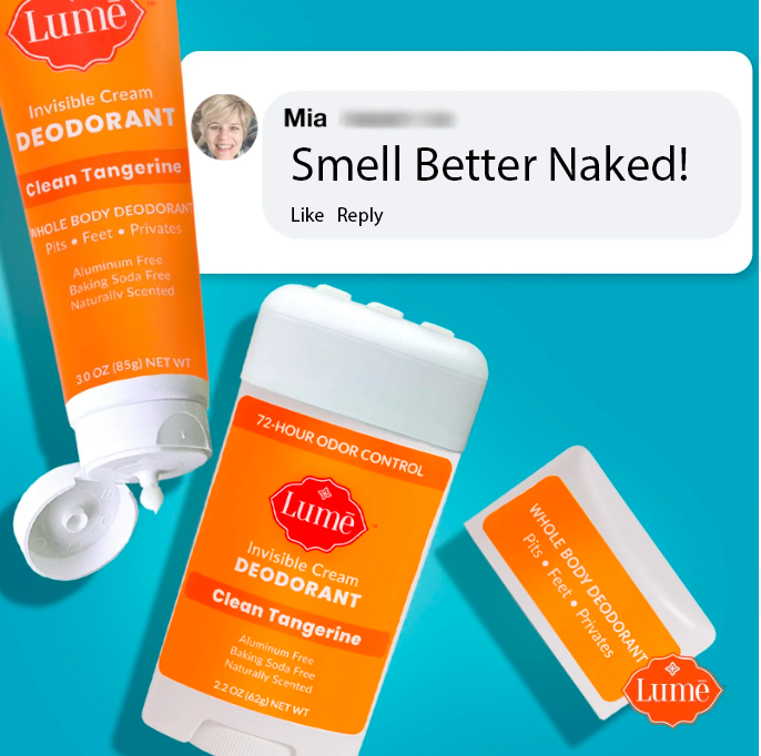
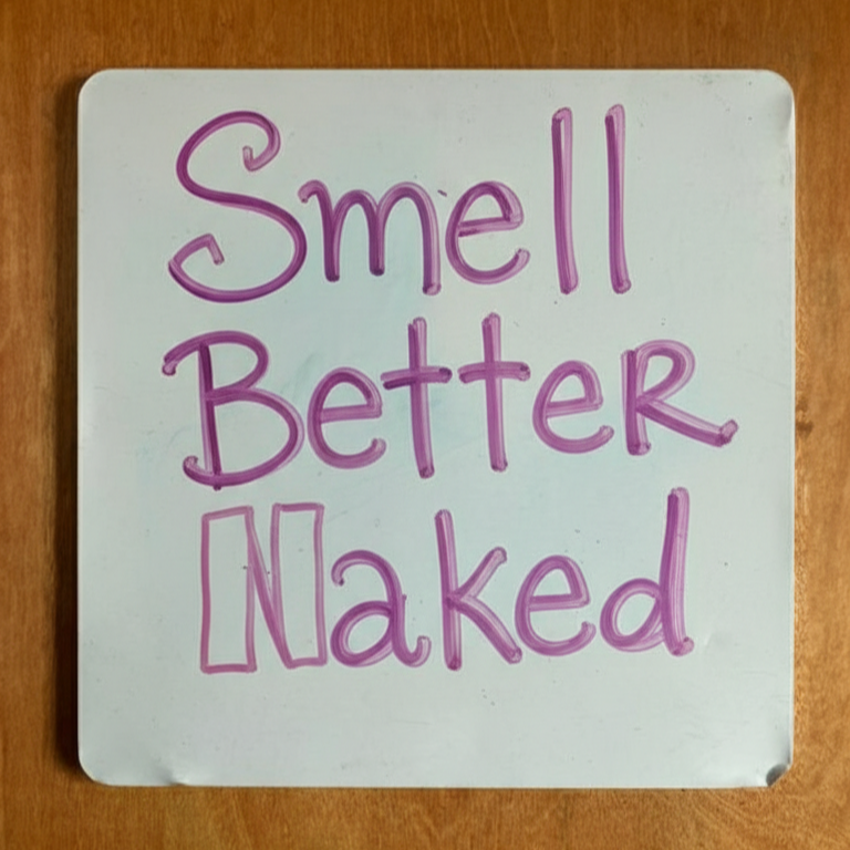
Lume’s got a bold voice, so we leaned into it. While testing a batch of new headlines, we dropped in “Smell Better Naked” which is short, direct, and very on-brand to see how it’d perform (mainly, is naked too risky? We also tried softer versions).
Insight
It wasn’t just a strong headline. It was sticky. “Smell Better Naked” consistently outperformed other hooks in statics and immediately stood out in copy-driven formats. So we started moving it across Stories, testimonials, reviews-as-ads, even motion cutdowns and it held up everywhere.
What I Made
I rolled out a full creative series using the same headline across formats we already knew worked: clean product statics, review overlays, carousel before/afters, and UGC voiceover setups. Each one hit. Same message, different containers.
How It Played Out
The hook became a modular plug-in (and then our tagline). It was something we could drop into proven formats when performance dipped or when we needed a fast win. Across the board, ads with “Smell Better Naked” outperformed similar formats with weaker hooks. We also tried other similar headlines “Naked never smelled so good”, etc. We found some other winning headlines that had the same message and punch.
What I’d Do Again
Identify winning copy early, then scale it sideways across formats. A good headline shouldn’t just live in one layout. If it’s strong, it should flex.
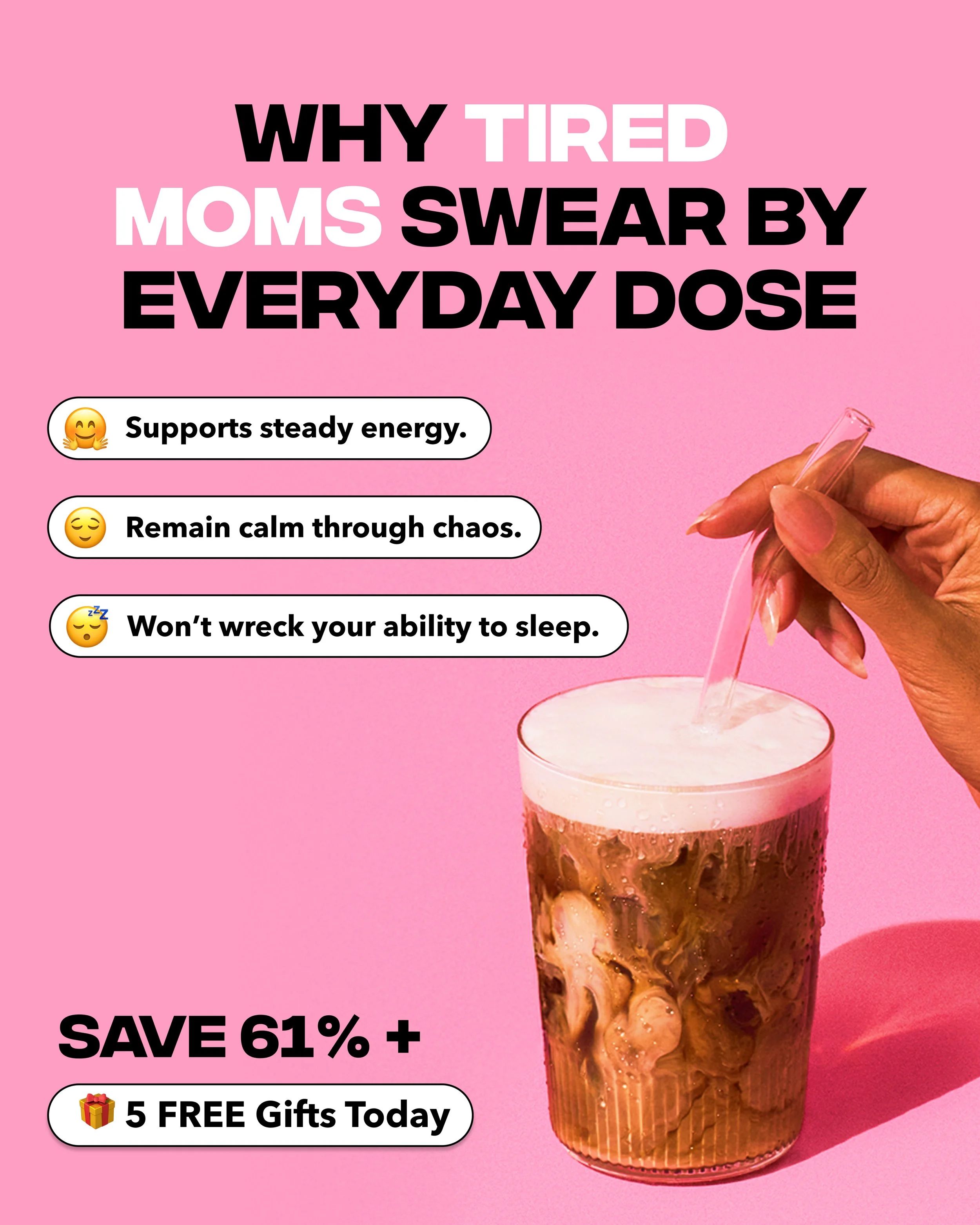
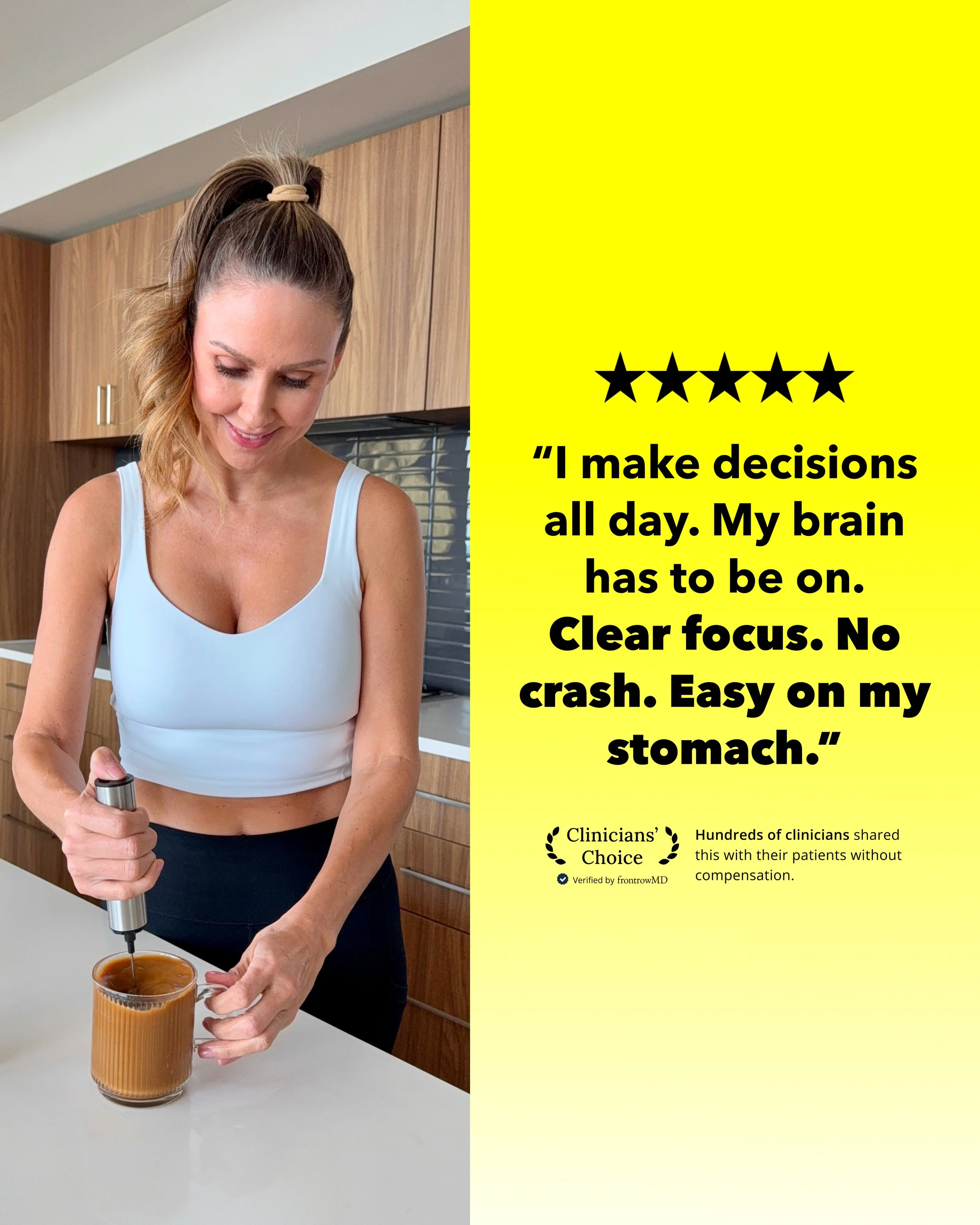
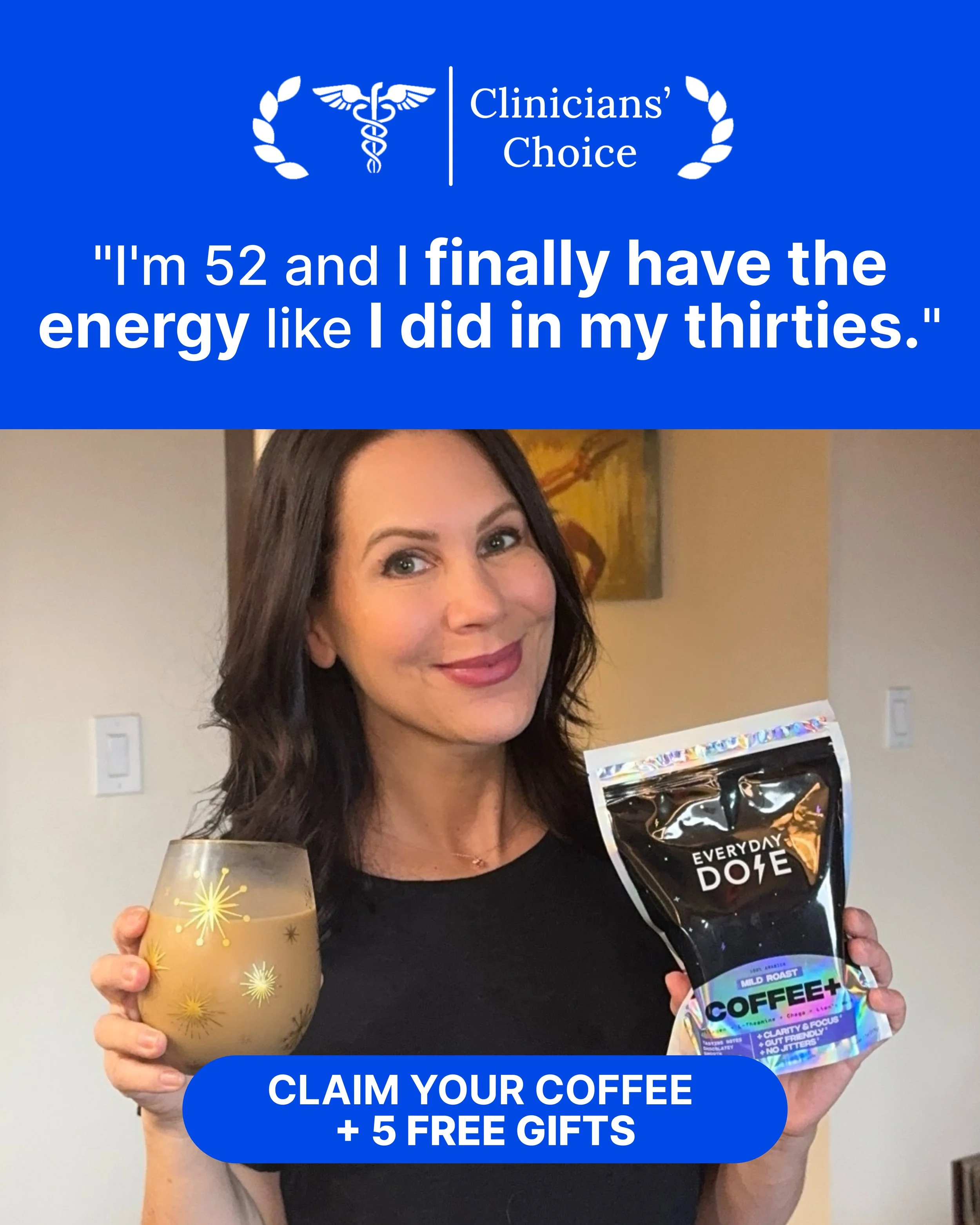
Persona Testing
Concept
We wanted to see how different ICPs responded to the same product and if the messaging needed to shift to match their mindset.
Insight
Our existing creative leaned generic “better for everyone” vibes. But Motion data showed stronger CTRs on ads that spoke to specific needs (like fatigue, digestion, or stress), which mapped to totally different personas.
What I Made
I built out persona-driven ad sets, each targeting a different user mindset like tired moms, busy entrepreneur's, aging beauty seekers, etc. Each used a variation of the same product story, adapted for tone, format, and visual style.
How It Played Out
Persona-led ads got stronger engagement across the board, especially when the copy matched their internal narrative. Biohackers clicked on ingredient breakdowns. Moms responded to stress relief. Founders liked blunt, relatable copy that skipped the fluff. And when a message didn’t hit for an ICP, we iterate and keep learning.
What I’d Do Again
Build creative by how they feel, not just who they are. The product didn’t change, the angle did. That’s what moves performance.