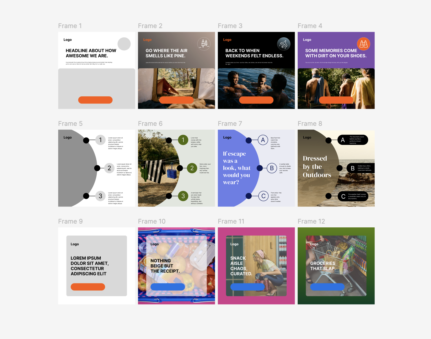
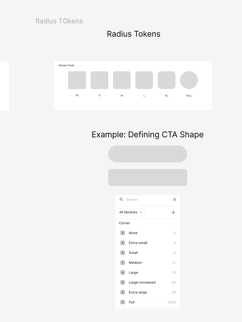
At my last job, there were two designers who were super fast but struggled with hierarchy, and two who had a great eye for detail but moved really slowly. So I built out a Figma system to help balance that out and speed things up across the board. We started by setting up shared styles: colors, type scales (like H1, H2, body, etc., using text styles), and spacing so that everything was easy to grab and consistent across projects.
Then we created a set of components: clear CTA’s and elements that matched our brand and made layout decisions quicker.
On top of that, we designed templates with strong visual hierarchy, so designers could drop in content and go. It was still flexible so our designers could tweak things based on the project, but the system gave them a solid starting point and reduced back-and-forth.
I don’t have access to the original Figma files anymore, so I mocked up quick visuals to show how I approach it since my portfolio doesn’t really highlight this.


VERY quick design - just showing the understanding of framing and how a grey-scaled templates could be used to create diverse ads.