
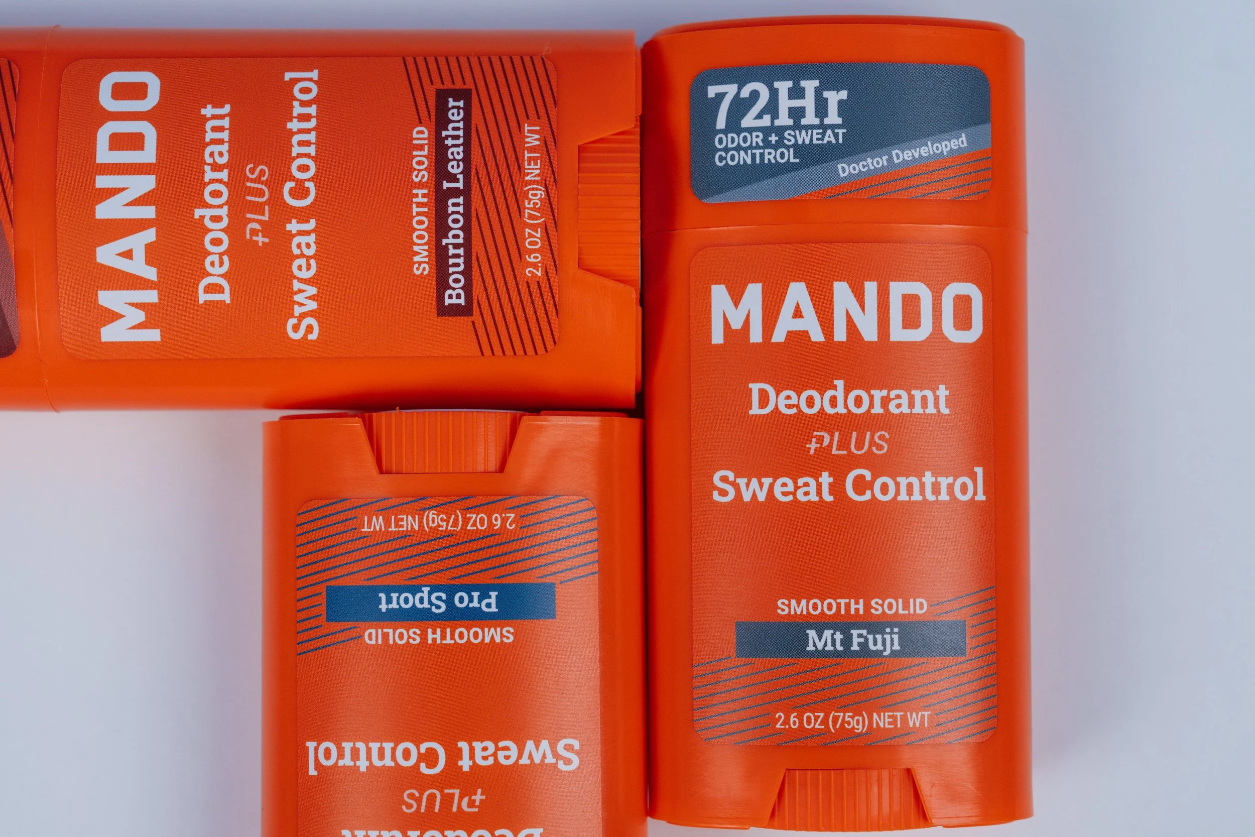
Client: Mando Whole Body Deodorant
Role: Brand Alignment, Brand Strategy, Creative Direction, Asset Refinement
The Ask:
Bring consistency and clarity to a fast-growing brand that had evolved quickly, leaving behind scattered assets, unclear design rules, and inconsistent messaging across platforms.
The Work:
I conducted a full 360° brand audit of Mando’s visual identity and presence—reviewing every touchpoint from packaging to ISM to Shopify and Amazon. I identified brand inconsistencies in everything from font usage to photography tone, and created a plan to bring cohesion across teams. I compiled and refined existing brand elements into a unified 97-page brand guide covering logo usage, typography, color systems, audience insights, and iconography. I worked cross-functionally to assign updates, align execution, and ensure everyone was building from the same playbook. I also then trained new employees on the brand when onboarding.
The Result:
A cohesive, easy-to-follow brand foundation that gave creative, marketing, and product teams clear direction and guardrails which helped streamline collaboration, helping Mando show up as one consistent, powerful voice across all platforms.


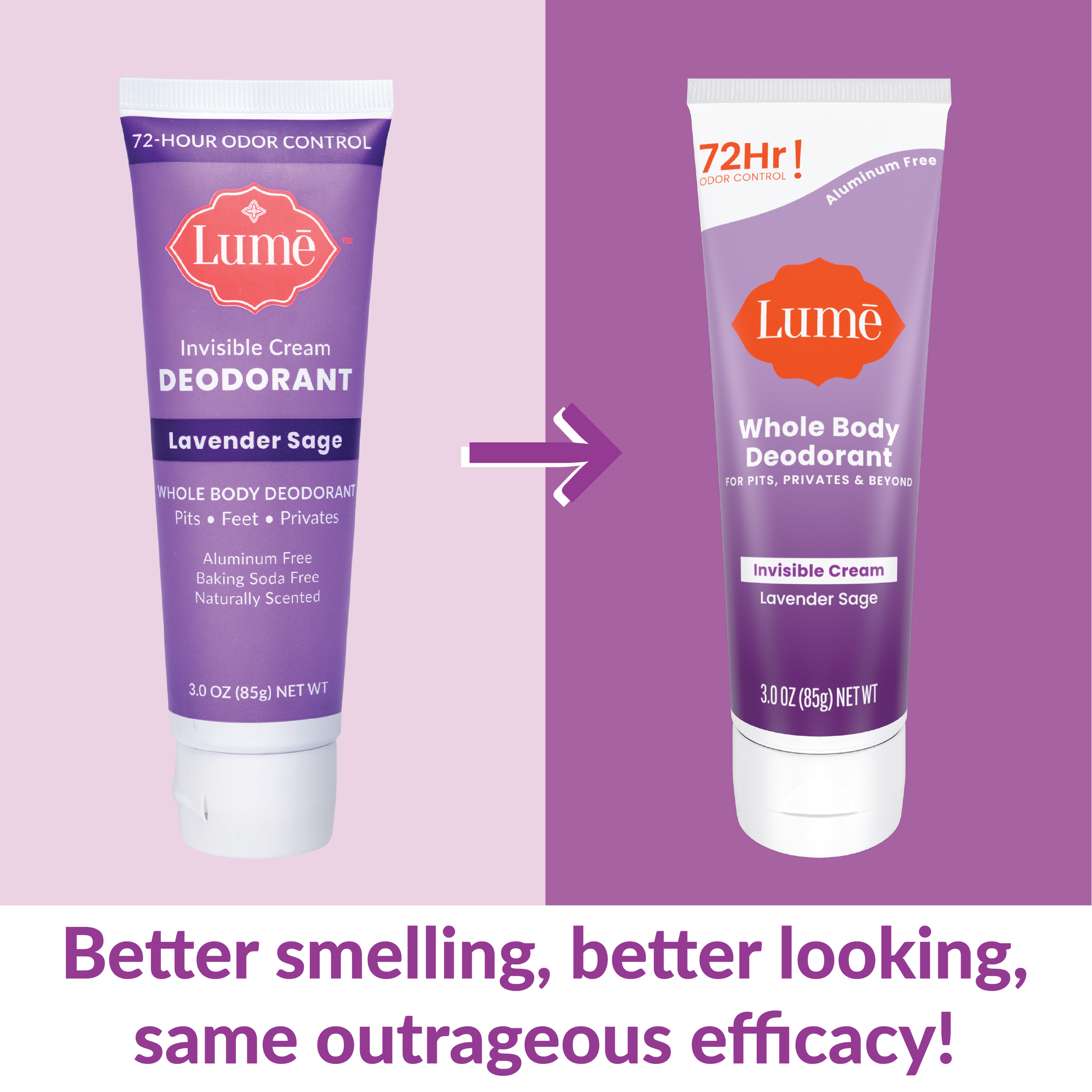
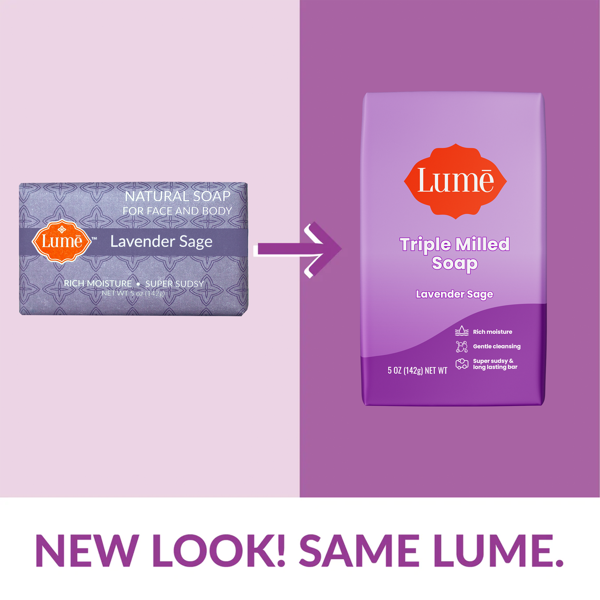
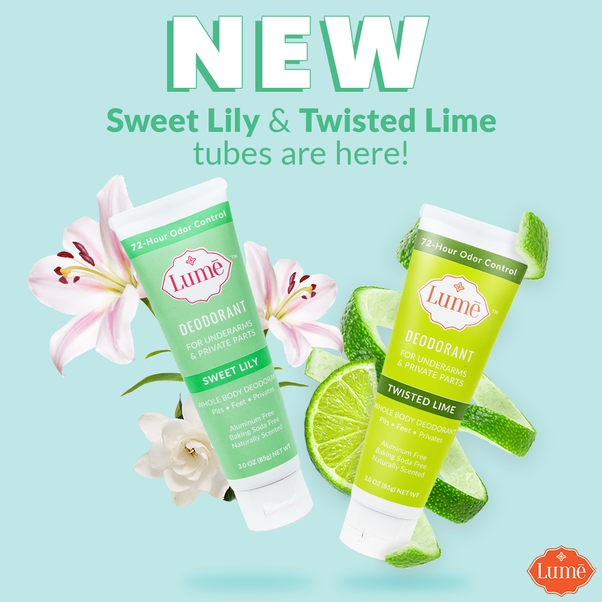
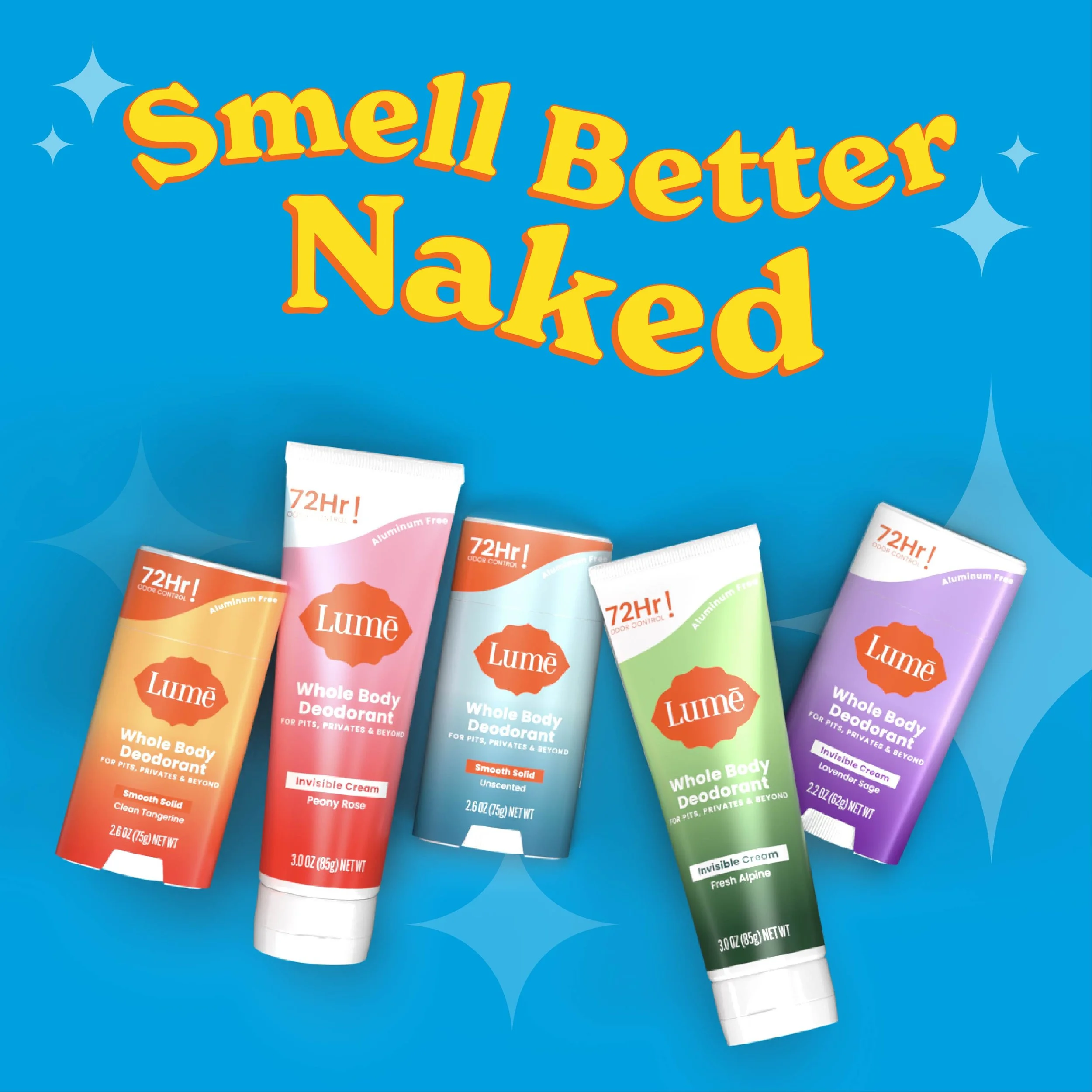
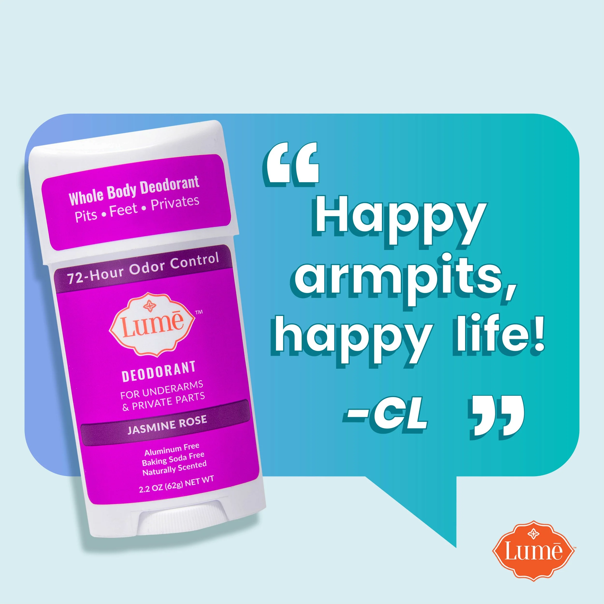
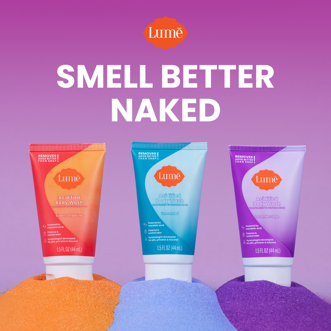
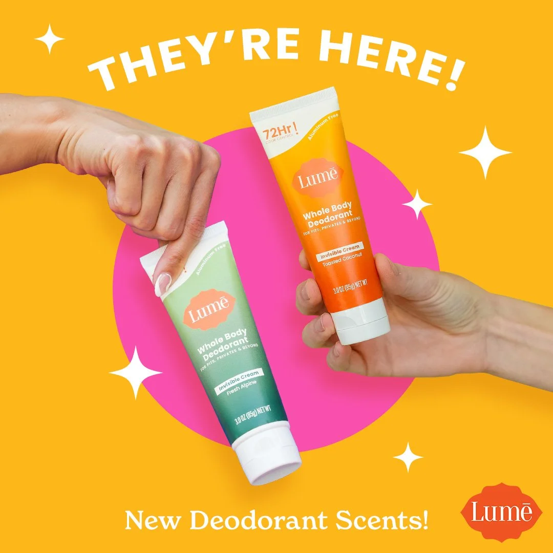
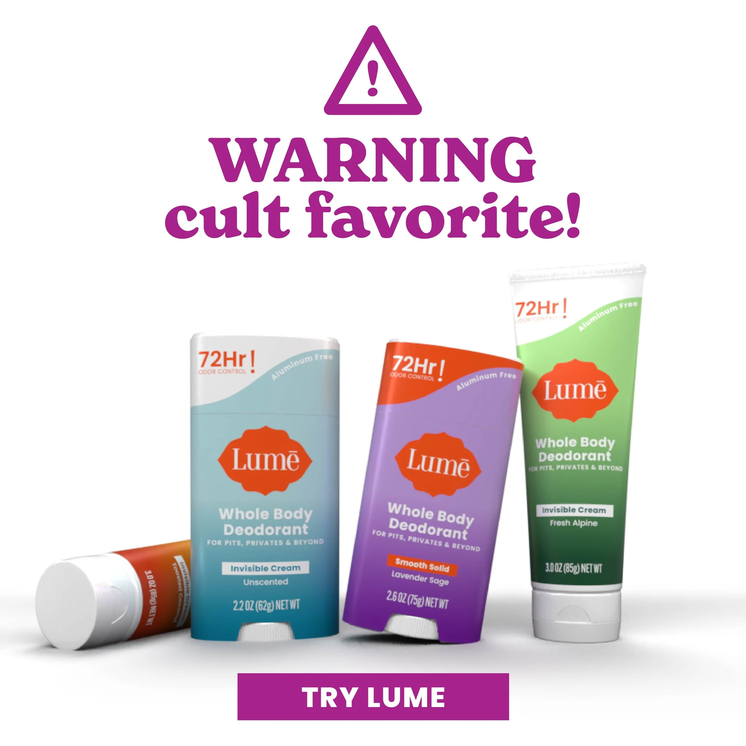
Lume Rebrand for Retail
Partnered with Lume’s internal creative team to evolve their brand identity as they expanded from viral success into retail. Focused on elevating the visual system to feel more premium and scalable, while keeping the quirky, science-backed tone that customers loved. Supported the rollout across campaigns, content, and product visuals, including building 3D renders in Adobe Stager for a more dynamic brand presence.
Scope & Vision
The ask was to refresh Lume’s brand as it evolved from a viral deodorant into a trusted personal care line expanding into retail. The goal: elevate the visual identity to feel more consistent, science-backed, and premium while keeping the quirky, approachable tone that made Lume stand out. We needed a scalable system that could flex across new products, campaigns, and content while staying bold and retail-shelf ready.
Approach
As part of the internal creative team, I collaborated on evolving Lume’s brand elements across paid ads, email, social, web, and internal brand foundation. I helped concept and applied the updated color palette, typography, and layout systems to campaign creative and developed modular templates to support high-volume content production. Working closely with brand, marketing, and strategy teams, I helped fine-tune the visual tone. Sometimes leaning clinical, sometimes keeping it playful, depending on the audience and channel.
Execution & Deliverables
Evolved visual identity and design system for Lume’s brand refresh
Designed paid ads, social content, and email campaigns with updated brand elements
Built modular templates to streamline high-volume content production
Developed 3D product renders in Adobe Stager to replace flat PNGs for a more dynamic, realistic product presentation across campaigns
Collaborated on campaign creative to ensure consistency across all touchpoints
Concept photoshoot for new branding
Outcome: Developed a smoother, more scalable creative system that maintained strong ad performance while increasing brand trust and consistency. The refreshed design elevated Lume’s presence across all channels, supporting multiple product launches and making the brand easier to recognize and grow. The evolved visual system became bolder, brighter, and more simplified which helped Lume transition from viral sensation to trusted retail brand.

Before

After

Before

After

Amazon and Web Packaging Announcement
Amazon and Web Packaging Announcement
Amazon and Web Packaging Announcement

Amazon and Web Packaging Announcement

Before - PDP Scent Description

After - PDP Scent Description

Before - PDP Scent Description

After - PDP Scent Description
Before - Scent Announcement

After - Scent Announcement

Before - Key Marketing Slogan
After - Key Marketing Slogan

Before - Paid Ad

Before - Paid Ad
Before - Paid Ad

Before - Paid Ad
After - Paid Ad
After - Paid Ad
After - Paid Ad

After - Paid Ad
Client: Blogger Seaside & Stilettos
Role: Logo Design. + Branding
The Ask:
Create a full brand identity for a fashion and lifestyle blogger blending playful seaside living with polished, put-together style. The client wanted a logo that felt feminine but not fussy, and visuals that captured both beachy ease and playful fashion.
The Work:
I led the project from concept to execution—starting with initial logo ideation and sketches, refining down to a minimal, line-art style logo that felt both stylish and personal. From there, I built a color palette that balanced soft pastels with grounded tones to reflect the contrast in the brand’s personality. I also created branded mockups (tote bag, notebook) and a photo direction that feels fresh, bright, and coastal without being cliché.
Results:
A clean and recognizable visual identity that tells the brand’s story at a glance—laid-back but confident, fun but refined. The final brand assets are cohesive, versatile, and ready to scale across content, merchandise, and digital platforms.


Client: Velvet House Social Club
Role: Logo Design, Brand Refresh
The Ask:
Refresh the existing Velvet House logo to feel more current and elevated, while maintaining the brand’s established identity and tone. The client wanted to explore how a refined logo could extend across print and digital touchpoints.
The Work:
I reimagined the logo with updated typography and a more polished visual mark that felt true to the brand’s moody, upscale aesthetic. Alongside the refreshed logo, I created mockups to show how the new look could show up in the real world—on drink menus, cocktail napkins, coasters, signage, and social media. The focus was on striking the right balance between timeless and memorable.
The Result:
A modernized brand mark that felt aligned with Velvet House’s identity but more intentional and cohesive. The visual concepting gave the client a clear sense of how the refreshed branding could elevate the overall guest experience and create consistency across platforms.


